

Direct answer: A Malaysian web-app landing page converts when it delivers message match with the ad or search intent, shows the product doing the job in under one screen of scrolling, backs claims with proof a buyer can verify, and reduces the commitment step to the smallest useful action. The examples below are organised by job-to-be-done, not by industry, so you can borrow patterns that fit your audience — SME operators, technical evaluators, or regulated enterprise buyers — without copying a layout that was tuned for someone else's traffic.
Key takeaways
- Every effective pattern starts with one job: activate, evaluate, compare, buy, or wait. Pick one before you design.
- Proof beats polish. Named customers, screenshots of the working product, and specific outcomes convert better than stock illustration.
- Mobile is the primary canvas in Malaysia — design the hero, form, and proof stack for a 390px viewport before you touch desktop.
- Speed is a conversion feature. Aim for LCP ≤ 2.5s, INP ≤ 200ms, CLS < 0.1 per Core Web Vitals.
- Message match with the referring ad or SERP result is the single largest lever most Malaysian pages leave unpulled.
How to use this pillar
Do not read this as a gallery. Each section is a pattern — the job it does, the evidence you need to make it credible, the layout structure, the failure modes, and a stylised recreation. Use the audit checklist at the end to score your live page against the patterns that match your buyer.
1. Information hierarchy: one job per screen
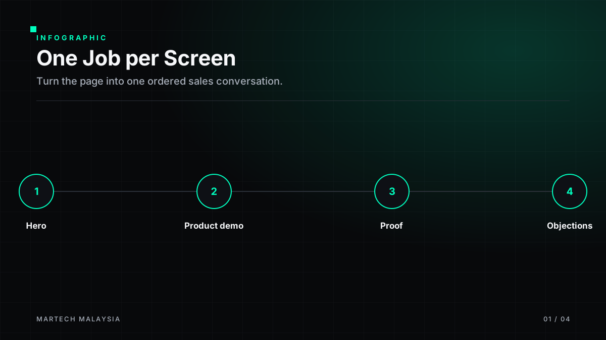
A landing page is not a homepage. It is a single sales conversation compressed into scrolling. The strongest Malaysian web-app pages we see resolve four questions in order: What is it? Who is it for? Why should I believe you? What do I do next? Anything that does not serve one of those four questions is a distraction.
Above the fold
Category label, outcome-led headline, one-sentence sub-head, primary CTA, and a single piece of proof (logo strip, rating, or named customer). No carousel.
Second screen
Product demonstration — annotated screenshot, short loop, or interactive tour. Show the product doing the job you named in the headline.
Third screen
Proof stack: two or three case snippets with specific outcomes, integration logos if relevant, and any regulator/standard badges (PDPA, ISO 27001, SOC 2).
Fourth screen
Objection handling: pricing shape, security summary, FAQ. Repeat the primary CTA with the same wording used above the fold.
2. Search, ad and message match
Message match is the discipline of making the landing page finish the sentence the ad or SERP snippet started. If your Google Ads copy promises "WhatsApp CRM for Malaysian SMEs", the H1 must contain "WhatsApp CRM", not "AI-powered customer engagement platform". Google's own Quality Score documentation flags landing-page experience as one of three components; message match is the operational lever that moves it.
| Traffic source | What the visitor read | What the H1 must confirm |
|---|---|---|
| Branded search | "[Your brand] pricing" | Pricing is visible above the fold, not gated. |
| Non-brand search | "marketing automation Malaysia" | The category, the country, and one differentiator. |
| Paid social | Problem-led hook (e.g., "leads leaking out of WhatsApp?") | The same problem restated as an outcome. |
| Comparison content | "X vs Y" | A comparison table, not a generic overview. |
3. Patterns organised by job-to-be-done
Job A — Activate a self-serve trial
Best for products with a genuine free tier and short time-to-value (analytics, form builders, no-code tools). The hero should compress signup to a single field, defer the credit card, and show the product's first "aha" moment before asking for anything else.
- Hero CTA: "Start free — no card". Secondary link: "See a 90-second tour".
- Proof: Named customers with matching logo, plus a G2/Capterra rating if you have one that is current.
- Failure mode: Asking for a phone number in step 1. Every extra required field on a self-serve form removes qualified users; the Baymard Institute checkout research documents the same effect in commerce.
Job B — Support a technical evaluator
Best for developer tools and APIs. The evaluator wants to see the code, the auth model, and the pricing before they talk to anyone. Hide nothing behind a form they can Google around.
- Hero: A working code snippet, tab-switchable between languages, with a "Copy" affordance.
- Proof: Public status page link, latency numbers with methodology, and named engineering blogs that reference you.
- Failure mode: Marketing copy where documentation is expected. Evaluators leave when the first request for a curl example returns a "Book a demo" modal.
Job C — Win a comparison
Best for categories where the buyer has already shortlisted two or three vendors. The page must acknowledge the alternative by name, state where each option wins, and give the buyer language to defend the choice internally.
Structure: Category summary → honest capability matrix (yours vs. theirs) → one paragraph on when the alternative is the right pick → migration or onboarding proof → CTA to a scoped pilot.
Job D — Close a considered purchase
Best for mid-market and enterprise SaaS in Malaysia where legal, IT security, and finance all sign. The landing page here is not asking for a purchase; it is asking for the next meeting with the right people in the room.
- Above the fold: outcome headline, one named enterprise reference in-market, "Book a scoped assessment" CTA.
- Trust module: PDPA posture, data residency, sub-processor list, security certifications, and a downloadable one-pager.
- Do not put pricing above the fold unless it is truly self-explanatory. For enterprise, "starts from" with a clear qualification path is more honest than a fabricated tier.
Job E — Build a qualified waitlist
Best for pre-launch products or capacity-constrained pilots. The value being sold is access, not the product yet. Ask only for what you will use to sequence the waitlist (role, company size, one qualifying question).
4. Proof that actually converts
Proof is the section most Malaysian pages get wrong. Three principles:
- Named > anonymous. "A leading Malaysian bank" is weaker than "Maybank" if you have permission; if you do not, use a role-and-industry format ("Head of Digital, regional bank").
- Specific > adjectival. "Cut abandoned-cart follow-up from 3 days to 20 minutes" is stronger than "dramatically faster".
- Recent > timeless. Case studies older than 18 months should be re-verified before you republish. Products change; so do the numbers.
If you do not have named references, use process proof instead: a short public methodology, a screenshot of the actual dashboard, or a public changelog. Do not invent statistics.
5. Product demonstration patterns
Annotated screenshot
Cheapest, fastest, still the most effective for evaluators who scan. Label three UI elements that map to the headline promise.
Silent loop
4–8 second webm/mp4 showing one workflow. No audio. Pause on tab blur. Provide a static poster for reduced-motion users.
Interactive tour
Best-in-class for complex products. Guard the interaction cost — if it takes more than 20 seconds to reach the "aha" step, you have built a demo, not a hero.
6. Forms and commitment friction
Every required field is a tax on conversion. For a self-serve trial: email only. For a demo request: email, company, and role. Anything beyond that belongs in the follow-up, not the form. If your CRM insists on a phone field, make it optional and label it as such — do not disguise the ask.
PDPA note: Under the amended Personal Data Protection Act 2010 (Act A1727, in force 2025), consent must be specific to purpose and separated from a general terms checkbox. See our PDPA-compliant landing page forms guide for field-level patterns.
7. Mobile-first, in-market
Malaysian traffic skews heavily mobile across most consumer and SME segments. Design the 390px viewport first:
- H1 must fit in three lines at 28–32px without truncation.
- Primary CTA is one thumb-tap from the visible viewport — either sticky or within the first 600px.
- Any table or capability matrix collapses to a stacked card layout. Horizontal scroll for critical decision data is a failure state.
- Test with WhatsApp's in-app browser and Facebook's in-app browser — both strip cookies and behave differently from Safari/Chrome.
8. Localisation without theatre
Bilingual copy (English + Bahasa Malaysia) is table-stakes for consumer and public-sector-adjacent products. For B2B SaaS aimed at English-speaking operators, forced translation often hurts more than it helps — the sub-audience you actually sell to reads English fluently and treats machine-translated BM as a trust signal in reverse. Localise the elements that carry real weight: currency, tax phrasing (SST), regulator names (BNM, MCMC, PDP), and support hours in MYT.
9. Trust, privacy and security signals
- PDPA-compliant privacy notice link in the footer and beside every form.
- Data residency statement if you host in Malaysia or Singapore — buyers ask.
- Security page with at least: encryption in transit/at rest, access controls, sub-processor list, incident-response summary.
- If you claim ISO 27001, SOC 2, or PCI DSS, link the current certificate or attestation letter. Unlinked badges are a negative signal to procurement.
10. Accessibility as a conversion feature
Meet WCAG 2.2 AA at minimum. The commercial case is simple: keyboard-navigable forms, sufficient colour contrast, and clear focus rings help every user, especially on mobile. Reduced-motion preferences (prefers-reduced-motion) should pause auto-playing hero video.
11. Speed budgets and Core Web Vitals
Google's field data on Core Web Vitals is the credible reference: LCP ≤ 2.5s, INP ≤ 200ms, CLS < 0.1 at the 75th percentile. Practical constraints for a Malaysian landing page:
- Hero image: WebP or AVIF, ≤ 120KB, explicit width/height to prevent CLS.
- Fonts: two weights, self-hosted or preloaded with
font-display: swap. - Third-party scripts: audit ruthlessly. Every pixel you add is a p75 tax.
12. Measurement without self-deception
Pick one primary metric per page (e.g., verified email signups, qualified demo requests) and one guardrail (e.g., trial-to-paid at 30 days). Session-level analytics without a downstream outcome will make you optimise for engagement theatre. If you want the fuller measurement treatment, see the SaaS conversion benchmarks article.
13. Landing page audit checklist
| Area | Check | Pass criteria |
|---|---|---|
| Message match | Ad/SERP promise vs H1 | H1 contains the primary keyword or the promised outcome |
| Hierarchy | Four questions answered in order | What / Who / Why-believe / What-next visible in first 3 screens |
| Proof | Named references or process proof | At least one named customer or verifiable methodology link |
| Form friction | Required fields on primary CTA | ≤ 1 for self-serve; ≤ 3 for demo |
| Mobile | 390px viewport render | H1 fits; CTA reachable without scroll; no horizontal scroll |
| Speed | Core Web Vitals p75 | LCP ≤ 2.5s, INP ≤ 200ms, CLS < 0.1 |
| Accessibility | WCAG 2.2 AA | Contrast, focus, keyboard, reduced-motion respected |
| Privacy | PDPA posture | Purpose-specific consent, linked privacy notice |
| Measurement | One primary metric, one guardrail | Both instrumented and reported weekly |
Related reading
- Hero section patterns for web apps — the pattern-level companion to this pillar.
- SaaS landing-page conversion benchmarks (Malaysia) — how to plan and measure once the patterns are in place.
- PDPA-compliant landing page forms — field-level implementation.
- Web app landing page service — engaged support if you want a partner to run the audit and rebuild.
FAQs
How long should a Malaysian web-app landing page be?
As long as it takes to answer the four questions — no longer. Self-serve products can convert on one long screen; enterprise buyers usually need four to six screens because their proof, security, and pricing modules are heavier. Length is a symptom, not a target.
Do I need a Bahasa Malaysia version?
For consumer, SME operator, and public-sector-adjacent audiences, yes — either a full BM version or key modules translated (hero, pricing, privacy). For English-first B2B SaaS aimed at technical or senior operators, English-only is usually fine; forced translation can lower trust when the register slips.
Should pricing be on the landing page?
Yes if you can state it honestly (self-serve tiers, per-seat, per-usage). No if "it depends" is the only truthful answer — in that case, publish a range with the qualification path instead of a fabricated starter tier.
How many CTAs should the page have?
One primary action repeated. A secondary action (tour, pricing, comparison) is fine. More than that and you are asking the visitor to make your prioritisation decision for you.
What is the fastest audit I can run today?
Open the page on a mid-tier Android device on 4G. If the H1 does not match the ad you ran, the CTA is more than one thumb-tap away, or the first proof element is stock illustration, you have found your top three fixes.
Sources and further reading
All sources retrieved 17 July 2026.
- Google. Core Web Vitals. web.dev.
- Google Ads Help. About Quality Score.
- W3C. WCAG 2.2 Quick Reference.
- Baymard Institute. Cart abandonment research index.
- Personal Data Protection Department, Malaysia. Official portal — Personal Data Protection Act 2010 and Amendment Act A1727.
Frequently asked questions
Should I copy a global example directly?
No — patterns translate, specifics rarely do. Study the structural choice (proof placement, CTA hierarchy, objection handling) and adapt it to your audience and offer.
How long should a landing page be?
As long as it needs to close the objection gap for a given awareness level, and no longer. Cold traffic usually needs more; warm traffic needs less.
Do Malaysian users behave differently?
The fundamentals of clarity, trust and speed apply everywhere. Local nuances that matter most: mobile-first performance, PDPA-appropriate form language, and payment/localisation cues where relevant.