

Direct answer: A web-app hero has one job — get the right visitor to make one specific next decision. The eight patterns below (category creation, pain-led, product-led, outcome/proof, comparison, calculator, waitlist, and high-trust) work in different contexts because they carry different evidence. Pick the pattern that matches your buyer's stage of awareness, not the one that looks fashionable this quarter.
Key takeaways
- Match the hero pattern to the buyer's awareness level — Eugene Schwartz's five levels of awareness still holds up.
- Every pattern requires specific evidence — the pattern is a promise; the evidence keeps it.
- Design the mobile hero first; desktop is a widening exercise, not a redesign.
- Motion is optional. Clarity is not. Respect
prefers-reduced-motion. - One primary CTA. A secondary link is fine. A carousel of promises is not a hero.
What a hero actually is
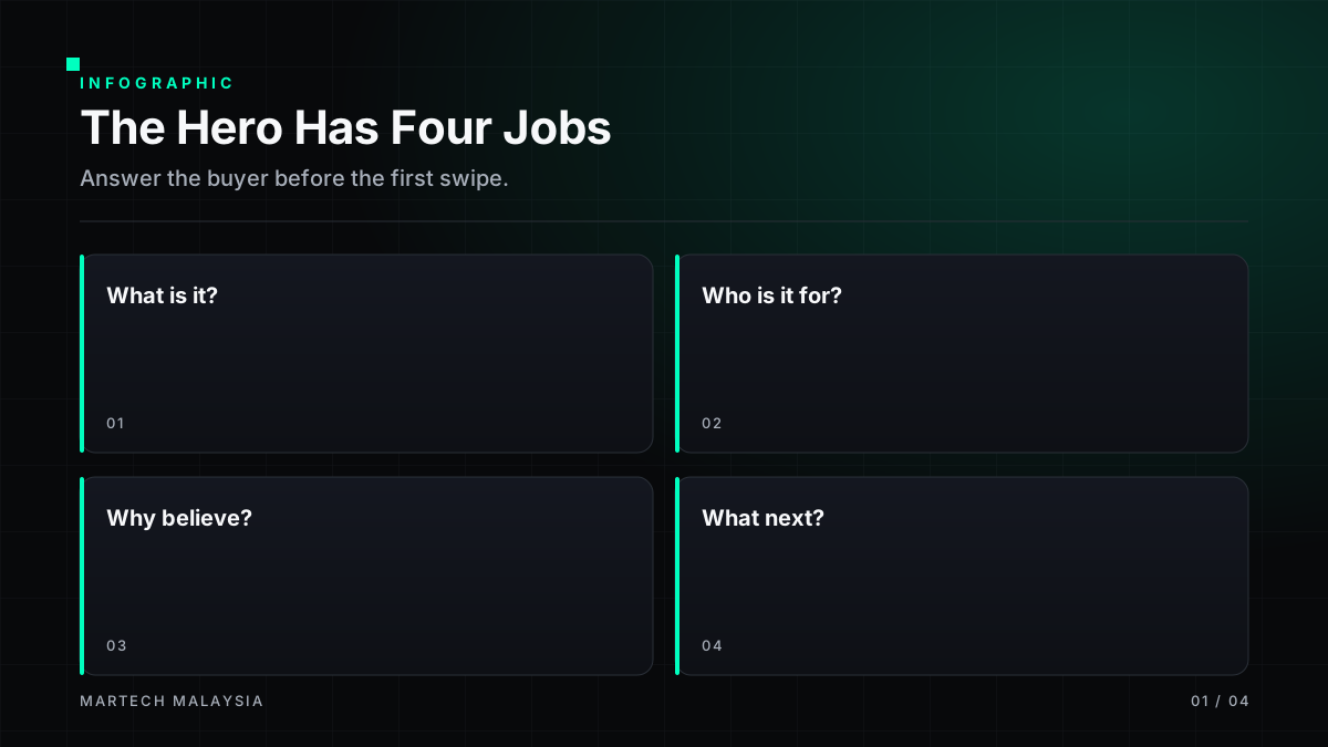
A hero is the first ~600 vertical pixels on mobile — the block of screen that decides whether the visitor keeps scrolling. It has to do four things in the time a thumb takes to swipe: name the category, name the outcome, name the audience, and offer one action. Everything else on the page is negotiation; the hero is the opening line.
Pattern selector
Before picking a pattern, answer three questions:
- Awareness: Does the visitor know the problem, know the category, or know you?
- Evidence: What proof can you show above the fold — named customers, a working product, numeric outcomes, or none yet?
- Action: What is the single next step — start free, book a demo, join a waitlist, use a tool?
| Awareness | Best-fit pattern | Required evidence |
|---|---|---|
| Unaware / problem-aware | Pain-led | Named symptom the audience recognises |
| Solution-aware, new category | Category creation | Definition, contrast with old way, one proof anchor |
| Solution-aware, mature category | Outcome / proof | Named customer + specific outcome |
| Comparing vendors | Comparison | Honest capability matrix |
| Technical evaluator | Product-led / demo | Working snippet or interactive UI |
| Curious researcher | Calculator / tool | An input → output moment they keep |
| Pre-launch | Waitlist | Credible team + concrete scope |
| Regulated buyer | High-trust | Certifications, references, sub-processor list |
Pattern 1 — Category creation
Used when the product does something that doesn't yet have a widely accepted name. The hero must define the category in one sentence and contrast it with the "old way" the buyer knows.
Copy framework: "The [category] for [audience]. [Old way] made [pain]. We [new mechanism] so you [outcome]."
- Works when: You have a founder-authored point of view and at least one lighthouse customer.
- Fails when: The category label is jargon the buyer must Google to understand.
Pattern 2 — Pain / problem-led
The hero names the visitor's problem back to them before offering anything. Effective for outbound and paid-social traffic where the visitor is problem-aware but not solution-aware.
Copy framework: "[Specific pain]? You are not alone. [Product] gives [audience] [outcome] without [status-quo cost]."
- Evidence: A short customer quote that names the same pain in their own words.
- Failure mode: Pain that is too generic ("marketing is hard") reads as filler. Be specific enough that half your visitors think you were reading their Slack.
Pattern 3 — Product-led / demo hero
The hero is the product. A working input, a live snippet, an embedded UI, or a click-through preview. Best for developer tools and self-serve SaaS with a short time-to-value.
- Design rule: The interactive element must reach the "aha" moment in under 20 seconds and under three clicks.
- Accessibility: Provide a keyboard path and a static fallback for reduced-motion users.
- Performance: Lazy-load anything below the fold; the demo itself must not blow LCP.
Pattern 4 — Outcome / proof hero
Best for mature categories where the buyer knows the space and is deciding between vendors. The hero leads with a named customer and a specific outcome.
Copy framework: "How [named customer] [achieved specific outcome] with [product]." Sub-head restates the audience and the mechanism.
- Numbers must be defensible. Include the timeframe and the definition ("30-day trial-to-paid", not "conversions").
- Rotate proof if you have more than one lighthouse — but never carousel it. Pick one for the hero and put the rest below.
Pattern 5 — Comparison hero
For traffic that already types "X vs Y" into Google. The hero acknowledges the incumbent by name and previews where you win — without pretending the competitor has no strengths.
- Do not put a full matrix in the hero; put the honest one-line summary and a "See the full comparison" link.
- Include a paragraph on when the alternative is the right choice. It builds trust and pre-empts objections.
Pattern 6 — Calculator / interactive tool
The hero gives the visitor a small, useful result before asking for anything. Works especially well for pricing-sensitive B2B products (ROI calculators, sizing tools, feasibility checks).
- The tool must give a useful answer without capturing an email. Capture optionally, to email the detailed version.
- Store the visitor's inputs in local state so returning users don't start over.
Pattern 7 — Waitlist hero
Used pre-launch or when access is deliberately constrained. The value being sold is access, not the product.
- Evidence: Team, scope, and a credible timeline. Vague "coming soon" pages under-perform against pages that show one screenshot and one date range.
- Form: Email + one qualifier (role, company size). Do not ask for more than you will use to sequence the list.
Pattern 8 — High-trust / regulated hero
For fintech, healthtech, govtech, and any B2B where procurement is heavy. The hero visibly carries trust signals that the buyer's compliance team will look for anyway.
- Named regulator alignment (BNM, MCMC, MOH) where accurate — and only where accurate.
- Security certifications with linked, current attestations. Unlinked badges are worse than none.
- A "For security teams" secondary link that goes straight to the security page.
CTA design across all patterns
Primary CTA
Verb + outcome. "Start free trial" beats "Get started". "Book a scoped assessment" beats "Contact us". One primary, one style, repeated below the fold with identical wording.
Secondary CTA
Lower-commitment path — "See a 2-min tour", "View comparison", "Read the docs". Visually subordinate to primary. Never competes for the same intent.
Visual hierarchy inside the hero
- Category label / eyebrow — 12–14px, letter-spaced, colour-tinted.
- H1 — 36–56px desktop, 28–34px mobile, max three lines mobile.
- Sub-head — 16–20px, one sentence, states audience and mechanism.
- Primary CTA + secondary link — CTA left-aligned with the H1 on desktop; full-width on mobile.
- Proof anchor — one logo strip, one rating, or one named customer line.
Mobile adaptation
- Design at 390px viewport, then widen. Do not scale down a desktop hero.
- Media (screenshot, video) sits below the copy on mobile, above or beside on desktop.
- Sticky CTA on scroll is acceptable once the initial hero has left the viewport.
- Test inside WhatsApp's and Facebook's in-app browsers — cookie behaviour and viewport chrome differ.
Accessibility and performance
- Meet WCAG 2.2 AA for contrast (4.5:1 body, 3:1 large text), keyboard focus, and reduced motion.
- Hero image budget ≤ 120KB (WebP/AVIF), explicit width/height,
fetchpriority="high". - LCP element is almost always the H1 or hero image — measure with Core Web Vitals field data, not lab-only Lighthouse runs.
- Auto-play video must be muted, looped, and pausable; provide a poster frame and honour
prefers-reduced-motion.
Common failure modes
- Carousel of promises. If you cannot pick one hero, the visitor cannot pick you.
- Stock illustration instead of the product. Especially for evaluators — show the UI, even if imperfect.
- Adjective stack. "Powerful, intuitive, AI-driven" carries no information. Cut every adjective a competitor could also claim.
- Ambiguous CTA. "Learn more" is not a CTA. Say what happens next.
- Two primary CTAs. Splits attention and depresses conversion on both.
- Video that autoplays with sound. Instant back-button.
Copy framework — fill in the blanks
Eyebrow: [Category label for your audience]
H1: [Outcome verb] [specific outcome] for [audience], without [status-quo cost]
Sub-head: [Product name] is the [category] that [mechanism] so [audience] can [job-to-be-done].
Primary CTA: [Verb] [outcome] — [reassurance, e.g., no card, 15 min]
Proof line: Trusted by [named customer], [named customer], and [n] more [audience] across [region].
Decision flow
- What does the visitor already know? → picks awareness row.
- What proof do I actually have today? → filters pattern list.
- What one action moves the deal forward? → sets CTA copy.
- Can I ship the mobile version in a week? → if not, simplify the pattern.
Related reading
- Web app landing page examples (Malaysia) — the pattern gallery this article sits inside.
- SaaS landing page conversion benchmarks — measurement and planning.
- Web app landing page service — engaged support.
FAQs
Which hero pattern converts best overall?
There is no universal winner — the pattern that fits the awareness level of your traffic converts best. Product-led wins for developer tools; outcome-led wins for mature categories with named customers; pain-led wins for cold traffic. Test the pattern that matches your buyer, not the pattern a competitor happens to be using this month.
Should the hero have an image, video, or interactive demo?
Whichever most directly demonstrates the promise in the H1, at the lowest cost to page speed. For most Malaysian SaaS, an annotated product screenshot beats an autoplay video on Core Web Vitals and evaluator trust.
How long should the H1 be?
Short enough to fit three lines on a 390px viewport at 28–32px, specific enough that a competitor could not paste their name in front of it. If both a competitor and you could claim the same H1, it is too generic.
Can I use two CTAs in the hero?
One primary, one secondary — never two primaries. The secondary should reduce commitment (a tour, a comparison, the docs), not offer a parallel path.
Do I need a Bahasa Malaysia hero for a B2B SaaS?
Usually no for English-first B2B audiences. Yes for consumer, SME operator, and public-sector-adjacent products. Machine-translated BM in a hero often lowers trust; if you translate, have a native writer own it.
Sources and further reading
All sources retrieved 17 July 2026.
- Google. Core Web Vitals. web.dev.
- W3C. WCAG 2.2 Quick Reference.
- Nielsen Norman Group. How people read online.
- Schwartz, E. Breakthrough Advertising. Awareness levels framework, still widely cited.
- Google Ads Help. Landing page experience and Quality Score.
Frequently asked questions
Does the fold still matter?
Yes — but not as a rigid boundary. On mobile especially, users scroll readily. The hero should communicate value immediately, but the strongest pages continue the argument below the fold rather than compressing everything into it.
Should the hero include a video?
Only when the product is easier to show than to describe. Autoplay muted loops can help; long videos rarely do. Never let a video block the primary CTA on mobile.
How much should I A/B test the hero?
Test only after fundamentals (clarity, hierarchy, single CTA) are in place. Tests on unclear heroes waste traffic.